This tutorial describes in a few steps how to make a very minimalistic poster advert in Photoshop. It is assumed that you have some basic Photoshop knowledge. You’ll learn to apply some basic design principles, techniques on choosing the right fonts and masking photographs.
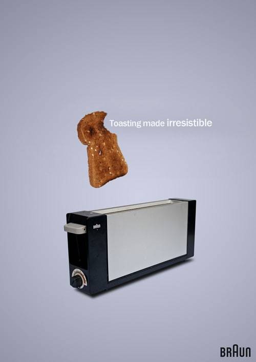
This will be our final end-result. The total time of completing this tutorial will be around 1 hour. Clicking images will in many cases enlarge the image. As well I like to use as many shortkeys as possible, so they are always mentioned behind the action. The Braun logo and all its rights are property of Braun GmbH.
Step 1: Starting up and making a background
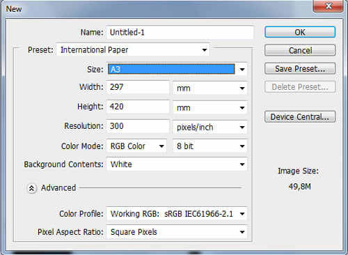
Since it is a poster, you want to come up with a big filesize. For really large designs, which are bigger as A3, it is in my opinion better to use a combination of inDesign and Photoshop, but that is not within the scope of this tutorial. So start up by making an new document (ctrl+N). For printing, it should be 300 dpi.
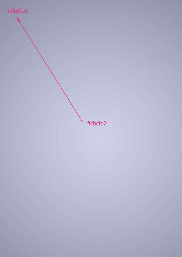
Delete the background layer and add a new layer (ctrl+shift+n) and call the layer ‘Background’ or BG. Draw a radial gradient using the gradient tool (g or shift g), like is showed below.
Did you know?
Using a hotkey in combination with shift shuffles the present active tool using the hotkey for the tool that is using the same hotkey. So when the paint bucket icon is visible, pressing g will lead to the paint bucket but pressing shift+g will result in the gradient tool.
Use #cbcfe2 for the foreground or inner colour and #8b8fa1 for the outer colour.
So that concludes the first step.
Step 2: Grabbing and masking the images
You can use your own images if you want, but that makes it harder to follow the tutorial. You can download the images here. Place them within the document, and optionally the layers can be grouped (ctrl+g). Start by scaling both images down so they fit in the middle of the poster using free transform (ctrl+t) (the final result shows how I scaled them).
Transforming a selection – a quick tip
In the final result the sandwich is somewhat rotated and the perspective somewhat altered. Using free transform tool (ctrl+t) it is very easy to come up with a good perspective: you can drag corners seperately from each other by holding ctrl and dragging them with the mouse.
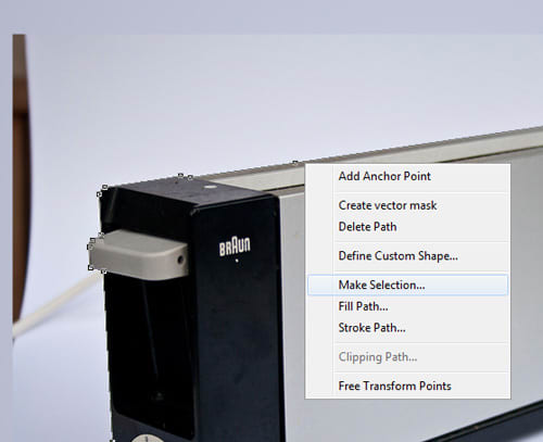
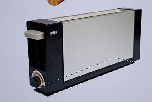
Now start tracing the outline of the toaster with the pentool (p), as shown in the image below. Add anchor points by clicking where necessary, such as around corners, and finaly close the loop (when you have gone all around) by clicking on the first anchor point. I also masked the shadow since I made one later on.
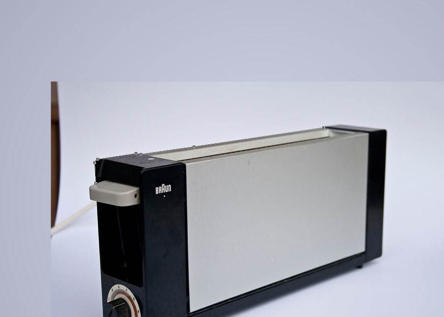
Since the toaster is mostly rectangular, with some slightly rounded corners, tracing should not be too hard.
Using the pentool – Some tips
When using the pentool you can create a path by adding anchor points. When clicking and holding the mouse you can drag the anchor handles in a certain direction, so the path itselfs get a curvature look. When having the pentool selected, holding ctrl will bring you to the direct select tool. With this tool you can move anchor points and alter anchor handles. Normaly the anchor handles are in a ‘180 degree’ straight line, but when holding alt when adding an anchor point you can make an anchor point without straight anchor handles. You can also move anchor handles seperatedly holding the alt-key when having the pentool selected. Learning the pentool goes best by practising!
No that the path is finished right-click on the path, and choose make selection from the options that show up (when make selection does not appear make sure you still have selected the pentool (p)).
Now that a selection has been made, it could eventually be turned it into a layer mask. However, it is better to refine the selection first. In real life, hardly any edge is completely sharp, and the refining edge option within photoshop is a very handy tool to smoothen and refine the edge. So having the toaster selected, select any select tool (m) and in the tool options section the refine edge… button should appear. Now refine the selection, I used the following settings:
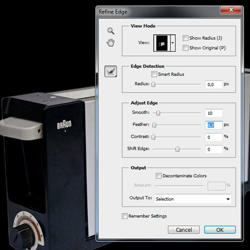
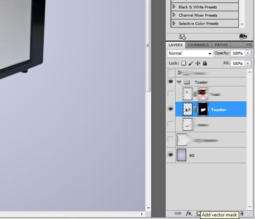
As you can see there are many options of showing the refined selection in the tool. I choose and like the on black option, and it revealed that I left a tiny white line at the left of the toaster, but it depends on the selection you are making what works bests. Finaly add a layer mask by hitting the vector mask button or by going to Layer > Layer Mask > Reveal Selection.
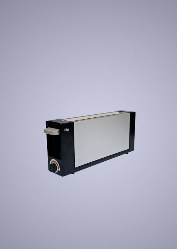
As you can see I’m a bit lazy, haha, but the layers that are blurred are the layers that you should not have yet ;). By know you should have this:
Finaly repeat all steps of selecting and masking for the toast/sandwich. So that will result in a masked image with a layer mask. You can also brush (b) with a white or black brush in the layer mask, since the sandwich has a lot more small details which you want to add and substract. I also masked some of the inner parts of the sandwich, the very small ones that are shown selected below using the magic wand tool (w).
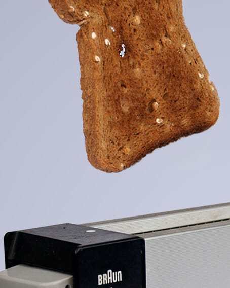
Step 3: Removing the ‘bite’
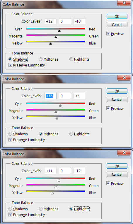
Before the bite is removed, it is a possibility to add some more color into the toast. I used Color Balance (ctrl+alt+b) with the following settings:
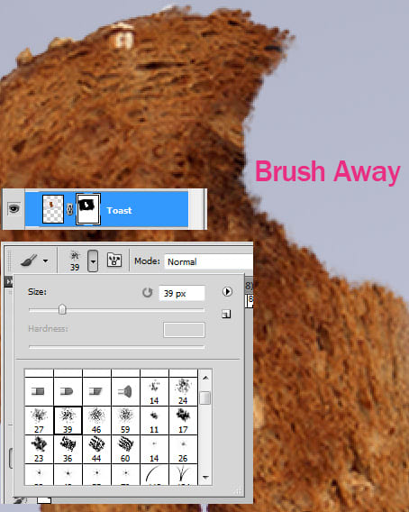
Now basically it using the brushtool (b) with a black 39px spatter brush (or another rougher brush) within the layer mask of the toast layer. Try to incorporate the shape of teeth and mouth in the toast.
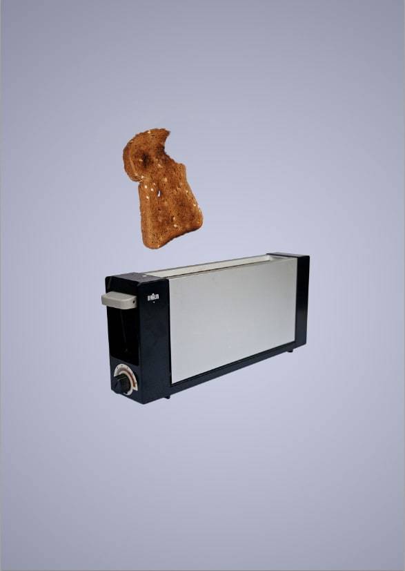
When brushing is finished, the progress should be somewhere as the image shown below:
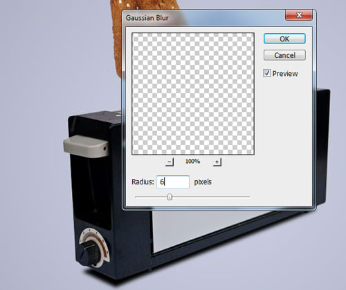
Step 4: Adding a shadow
Create a new layer (ctrl+shift+n), and place it below the toaster layer. Make a selection under the toaster which is as big as the bottom of the toaster, like showed in the images below. Fill it with a black color using the paint bucket tool (g).
Now apply a gaussian blur of around 5-6px (Filter > Blur > Gaussian Blur).
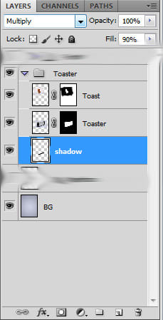
If you find the shadow too strong, you can lower the fill in the layers panel. When using a more detailed background, the shadow should also be on multiply as blending mode.
Step 5: Choosing the right fonts and font sizes
When making a poster act, the font is often an very important design element, besides the visual. So using the text tool (T) add a text in a new layer, in this case the text is: ‘toasting made irresistible’. Duplicate that text layer around five times (ctr+j duplicates the layer). Now make all layers a different font size, like I did below:
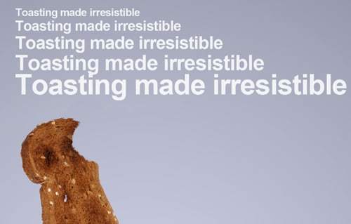
Now this is something that I can not explain technically, but basically it is shifting with the font sizes untill your ‘design’ intuition feels good. I picked the 30pt font-sized from my different sized texts, because I felt that looked best.
A font-size is chosen, but still a font needs to be chosen (the order of these two steps could as well be vica versa: first select the font then size). So again duplicate the text and pick for every text layer some font’s that match the rest of the poster well. Below is my example:
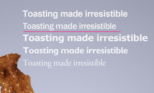
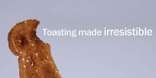
Finally I picked the ‘Franklin Gothic Medium’ font. I also made the word irresistible somewhat bigger, so that it stands out more, and placed the sentence ‘within’ the bite.
Looks nice, isn’t it?
Typographical settings
There is a lot more into typography as just explained in this tutorial, such as line distance and letter distance (leading and tracking) In the tutorial ‘learn about leading and tracking’ typography and leading and tracking is brought into the subject. You can find this tutorial here.
Optionlly, the Braun logo could be added. This is the poster after step 5:

Step 6: Final remarks en composition
Have you kept attention so far? That is great, because this is the last step! To make the toasting made irresistible stand out more, I brushed behind it with a very soft black brush and put that layer behind the text layer. I also reduced the fill of that layer to around 25%.
The difference between opacity and fill
Ever been wondering what the difference is between opacity and fill? Basically opacity influences the whole layer including layer effects, whereas fill only influences the layer itself and not the layer effects.
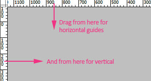
Now you might have followed the composition that is used in this tutorial. It is firstly centered based, but what if we apply the’ rule of thirds’ (many compositions have their focus point on 1/3 or 2/3 of the lenght or width) to the vertical axis this poster? It can be checked up using guides. Adding guides is easy, especially with rulers on (ctrl+r). Just drag from one of the rulers for a guide:
Place a horizontal guide at 1/3 and at 2/3 of the height of the poster. Also place one vertical at the middle. Now the composition and the guides looks like this:
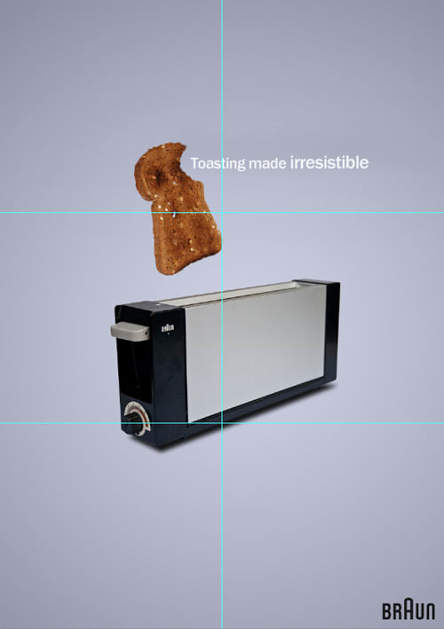
What I did personally is moving the toaster more towards the 2/3 line and the toast more towards the 1/3, and the word ‘toasting’ at crossing point of the the 1/3 guide and the vertical guide using the move tool (v).

Now you can always play a lot, also in scaling the toaster and toast until you think it looks good.
This is the endresult: